Now Reading: Mobile-First Strategies
-
01
Mobile-First Strategies
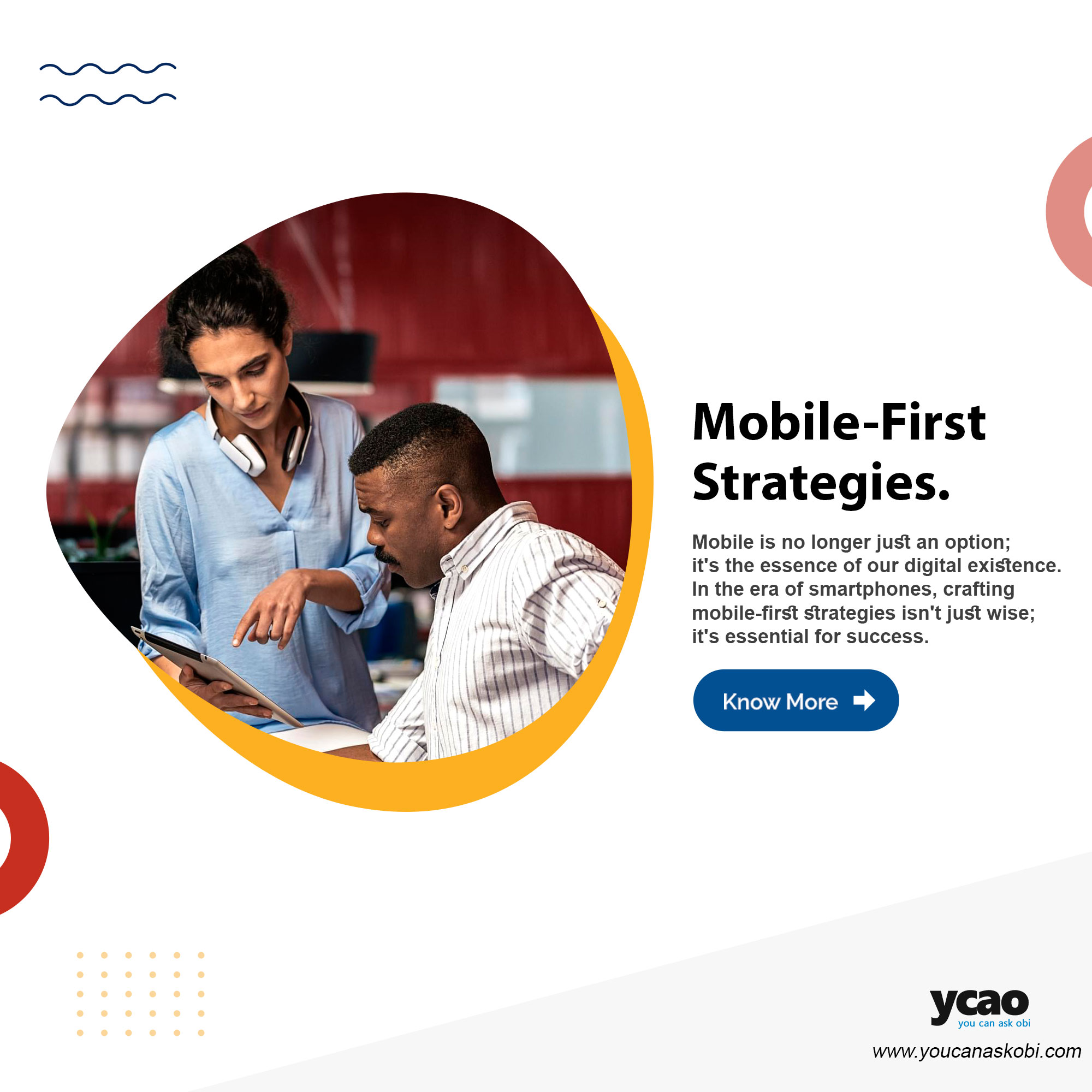
Mobile is no longer just an option; it’s the essence of our digital existence. In the era of smartphones, crafting mobile-first strategies isn’t just wise; it’s essential for success. Let’s explore why this approach is a game-changer in today’s digital landscape.
The Mobile-Centric World:
Our smartphones are always by our side like digital companions. It’s where we read the news, shop, socialize, and work. As businesses, embracing this mobile-centric reality is not just a trend; it’s adapting to how your audience lives.
The Need for Speed:
Mobile users have a need for speed. Mobile-first strategies prioritize lightning-fast loading times and responsive designs. Slow websites are a thing of the past, and instant gratification is the norm.
Google’s Mobile-First Indexing:
Google, the gatekeeper of online visibility, has transitioned to mobile-first indexing. This means Google predominantly uses the mobile version of the content for ranking and indexing. If your site isn’t mobile-friendly, you risk falling behind in search results.
Improved User Experience:
A mobile-first approach ensures a seamless and intuitive user experience on smaller screens. Navigation, readability, and functionality are all optimized for mobile users, making interactions effortless.
Reaching Your Audience Anywhere:
Mobile-first isn’t just about websites; it’s about reaching your audience wherever they are. Mobile apps, social media, and mobile advertising are all part of the equation. Your brand should be accessible in the palm of your hand.
Data-Driven Decision-Making:
Mobile usage generates a treasure trove of data. With mobile-first strategies, you gain user behavior, preferences, and location insights. This data empowers data-driven decision-making, allowing you to tailor your strategies to meet your audience’s needs.
The mobile-first mindset isn’t just a strategy; it’s a shift in perspective. It’s about recognizing that your audience is mobile, and your strategies should meet them where they are.
Let’s discuss the world of mobile-first strategies;
The Edge in Competitive Markets:
In fiercely competitive markets, a mobile-first approach can be your differentiator. When potential customers have seamless mobile experiences on your website or app, they’re more likely to choose your brand over the competition. It’s about standing out in a crowded digital marketplace.
Accessibility and Inclusivity:
Embracing mobile-first isn’t just about reaching your audience; it’s also about making your content accessible to all. It’s a commitment to inclusivity. Mobile-first design often goes hand-in-hand with creating content that accommodates various abilities and ensures that everyone, regardless of their device or physical limitations, can engage with your brand. It’s a step towards a more accessible digital world.
Cost-Effective Scaling:
For startups and smaller businesses, mobile-first strategies offer a cost-effective path to scaling your digital presence. By focusing on the mobile experience first, you can prioritize the most critical aspects of your digital strategy while ensuring you’re catering to a wide audience. It’s about strategic growth without stretching your resources too thin.
Future-Proofing Your Brand:
Mobile-first isn’t a fleeting trend; it’s a paradigm shift that’s here to stay. As technology continues to advance, we’ll see more innovations in mobile, from 5G connectivity to augmented reality experiences. A mobile-first approach positions your brand to adapt and thrive in this ever-evolving digital landscape. It’s about future-proofing your digital presence.
Join the Mobile-First Movement:
Embracing mobile-first strategies isn’t just about optimizing for a specific device; it’s a holistic approach to your digital presence. It’s about acknowledging that your audience is diverse, dynamic, and always on the move.
Are you ready to join the mobile-first movement? Share your thoughts and experiences with mobile-first strategies in the comments below. Let’s continue the conversation and explore the endless possibilities of a mobile-first world together!
Here are some mobile-first development tools along with their links for your reference:
-
Bootstrap:
- Link: https://getbootstrap.com/
- Description: Bootstrap is a widely used open-source front-end framework that offers a mobile-first design approach. It provides a range of responsive CSS and JavaScript components for building responsive websites and web applications.
-
Foundation:
- Link: https://foundation.zurb.com/
- Description: Foundation is another popular front-end framework that follows a mobile-first philosophy. It offers a responsive grid system, UI components, and templates to help developers create responsive and mobile-friendly web projects.
-
Materialize CSS:
- Link: https://materializecss.com/
- Description: Materialize CSS is a framework based on Google’s Material Design guidelines. It’s designed with mobile-first responsiveness in mind and provides CSS components for creating modern and visually appealing web applications.
-
Ionic Framework:
- Link: https://ionicframework.com/
- Description: Ionic is an open-source framework for building mobile and web applications. It’s particularly well-suited for creating hybrid mobile apps with a single codebase that works on multiple platforms, including iOS, Android, and the web.
-
Vue.js:
- Link: https://vuejs.org/
- Description: Vue.js is a progressive JavaScript framework that can be used for building user interfaces. It’s mobile-first friendly and provides tools for creating dynamic and interactive web applications.
-
React Native:
- Link: https://reactnative.dev/
- Description: React Native is a mobile application framework developed by Facebook. It enables developers to build mobile apps for iOS and Android using React, a popular JavaScript library. It’s a great choice for mobile app development with a mobile-first focus.
-
Appgyver:
- Link: https://www.appgyver.com/
- Description: Appgyver is a low-code development platform that allows you to create mobile apps and web apps quickly. It provides tools for designing mobile-first user interfaces and offers features for rapid prototyping and development.
-
Sencha Ext JS:
- Link: https://www.sencha.com/products/extjs/
- Description: Sencha Ext JS is a comprehensive JavaScript framework for building web applications with a focus on data-driven, mobile-first development. It includes a robust set of UI components and tools for creating responsive web apps.
These tools can be valuable for developers and designers looking to adopt a mobile-first approach in their web and mobile application development projects. Depending on your specific needs and preferences, you can explore these frameworks and libraries to streamline your development process.
Recommended Read: The Profound Significance of User Interface Design in the Digital Age
:: Article content supported by AI
Related Posts


Stay Informed With the Latest & Most Important News
Previous Post
Next Post


Advertisement